
Recently I spoke at Design Exchange Nottingham about playful UX. I’ve had a long standing interest in games as well as professional career in UX and I thought I’d talk about how they inform each other. Plus if all else failed I might get some people interested in some new games.
I’ve shared the slide deck on SlideShare:
But I thought I’d write up my notes as well since SlideShare wasn’t playing nicely with Keynote.

Introduction
The intention of my talk is to look at what we can learn about UX from games, what they can learn from UX and whether games can make us better designers.
Learning from Games
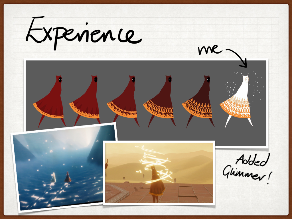
The first game I talked about was Monument Valley.
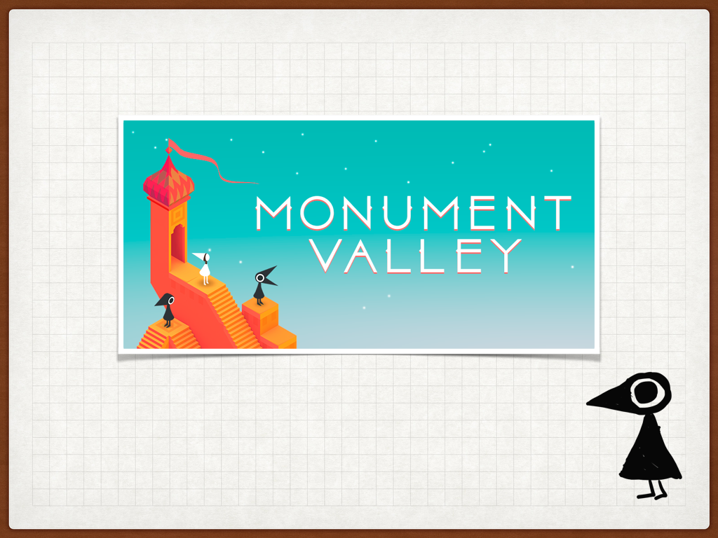
Monument Valley
Monument Valley is a great mobile puzzle game that won the best iPad game in 2014. It had about 2.5 million downloads, before it was mentioned on House of Cards. It has a loose narrative and a beautiful clean art style.
When talking about user experience in the real world, architects create some of the most interested spaces and experiences, such as these:
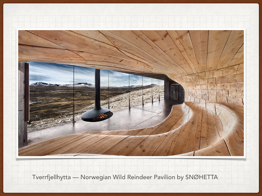
Tverrfjellhytta – Norweigian Wild Reindeer Pavillion by SNØHETTA

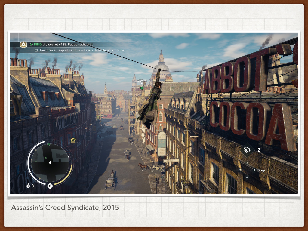
When we consider architecture in games, we are often talking about level design, whether it is the more traditional Victorian London or a more fantastical setting. But level design is the physical system setting for gameplay and often a key factor in designing your experience.

The advantage of a game space is you can explore spaces outsides of the confines of physics. Escher did this on paper and his work that plays with perspective has become well known and reused though out popular culture. Monument Valley takes our understanding of this and builds on it.
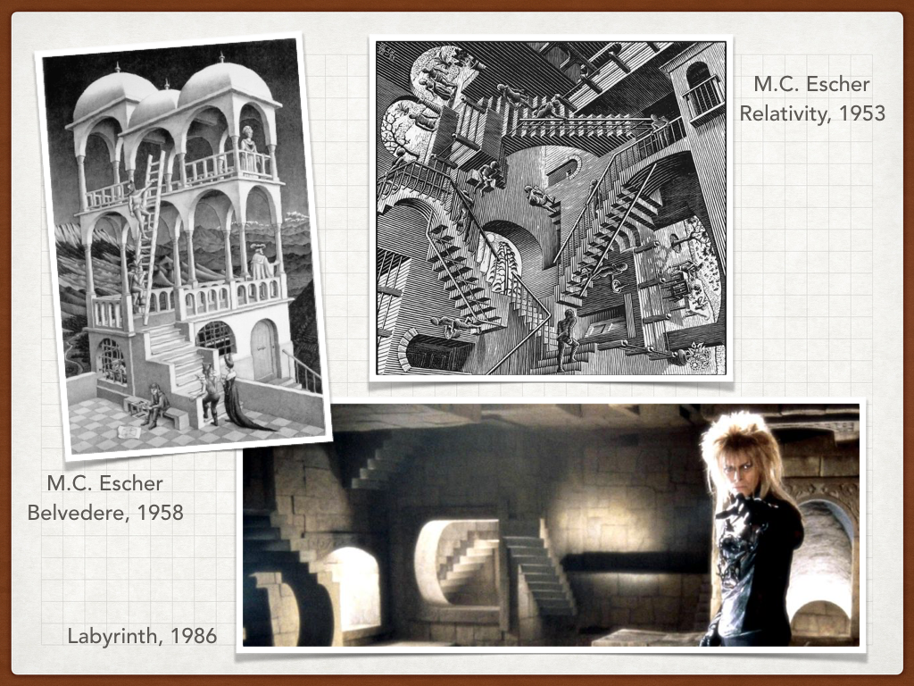
It isn’t the first game to do this. Fez also played around with ideas of perspective and if you like games that play on our expectations of physical space also try The Stanley Parable and Anti-Chamber.
UX: Remember to think about new ways of looking at what we think we understand. Challenge your own assumptions. Build on what is already understood.
However Monument Valley sets itself apart by existing within a touch screen interface. So it takes what we understand and it uses perceived affordances (buttons that look like you can push them, levers that look like you can pull them) to create a tactile interface that works in the touch screen environment.

Details in the interface catch our attention and draw our eyes to the areas of significance.
UX : Consider what is grabbing our attention and why
It gradually increases the difficulty, building on our understanding as we play through the game.

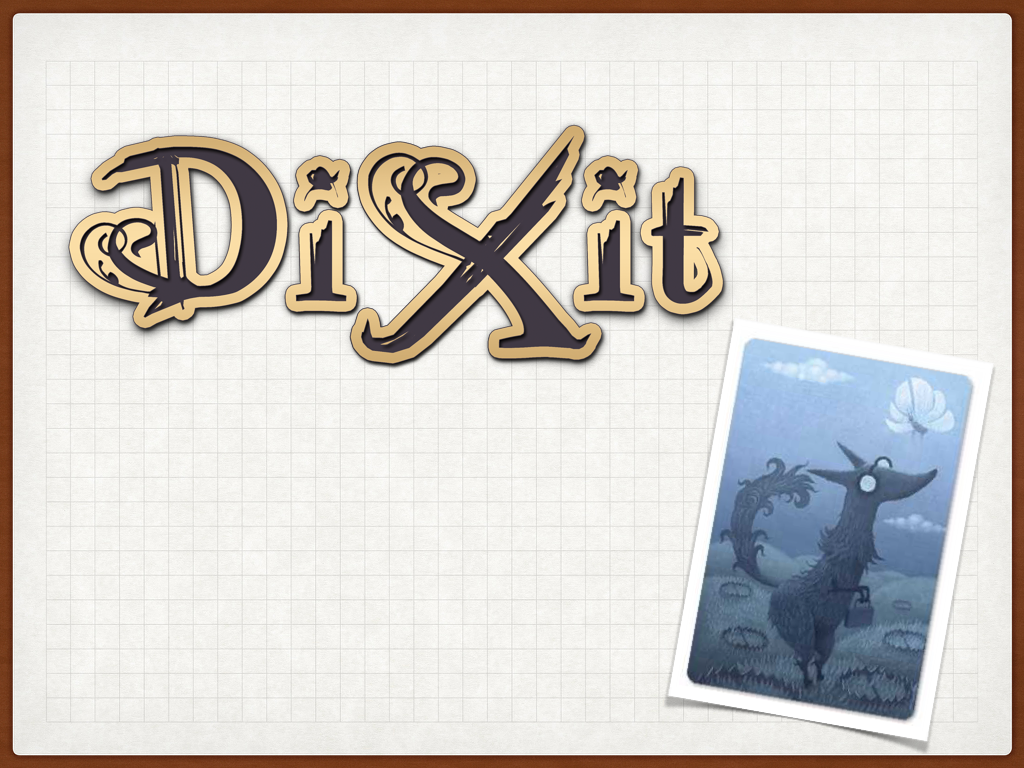
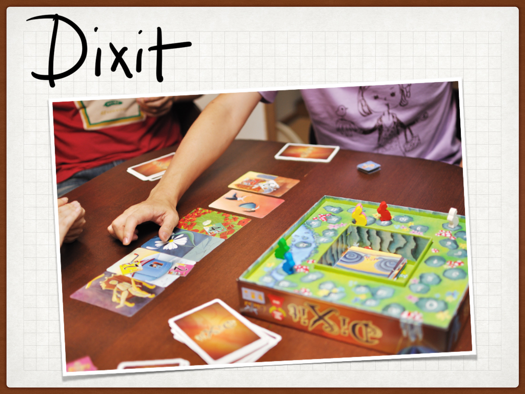
The second game I wanted to talk about was Dixit:
Dixit is a game of fairytale semiotics, which is to say it is a game of how we understand symbols and the world around us. The basic premise of Dixit is the player who’s turn it is choses a way to identify a card from their hand. Then everyone else also choses a card from their hand that they feel matches that identifier. The selected cards are shuffled and played and then everyone votes to try and identify the original card selected. However points are only awarded if not everyone selects the actual card. Points are also awarded to cards that get votes that weren’t the original card.
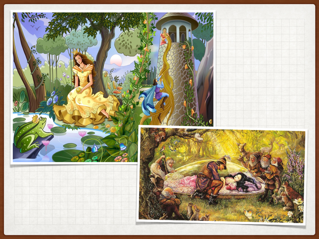
Dixit’s imagery is build upon the same visual iconography as children’s fairytales and in doing so it creates an atmosphere of imagination and a safe space in which to play.
Dixit’s card deck is full of gorgeously illustrated picture cards to fire off the imagination. It’s rich symbolism allows layers of meaning. So what you see and understand can be different to the next person. In Dixit it is important to understand your audience, in order to think about what they are seeing as so as to tailor your choice of descriptor so that only some of your audience will choose it. When we talk about a users frame of understanding in UX, we talk about mental models. What we experience affect who we are and how we perceive the world around us, so is critical in forming our mental models.
UX: Understand your users and their mental models. What they believe affects how they use your product.
If you are more of a semantics (language) person than a semiotics person then check out Codenames a game that uses a similar mechanic but with words.
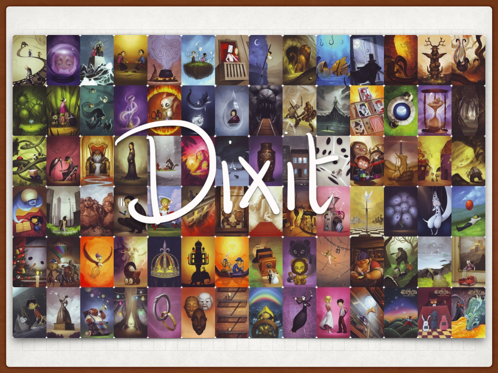
Dixit story cards
One of the beautiful thing about Dixit is it’s use of bunnies for points counters. I didn’t understand why at first as I played with adults, but once I watched a child count out the points it struck my how clever it it was. The bunny hops around the when counting out the points and the box is designed to make this experience delightful..
UX: Observe how something is used.
However the game evolved…

It was redesigned to allow up to 12 people to play. But now the bunnies have no context. In addition to this they’ve changed the voting system to use standard game components. These pegs may of been a financial constraint however they are poorly executed. If you put the peg in the card to vote and then put the card on the table the peg will fall out. You can see below how using the pegs upside down works around this problem.
UX: It a prime example of how people will adapt their environment to their needs, to make even bad design work.
Not all iteration improves a design, often we see as a website or application develops over time the original vision is lost and it becomes hard to use.
UX : User test after changes

This is one of my all time favourite games, Journey:
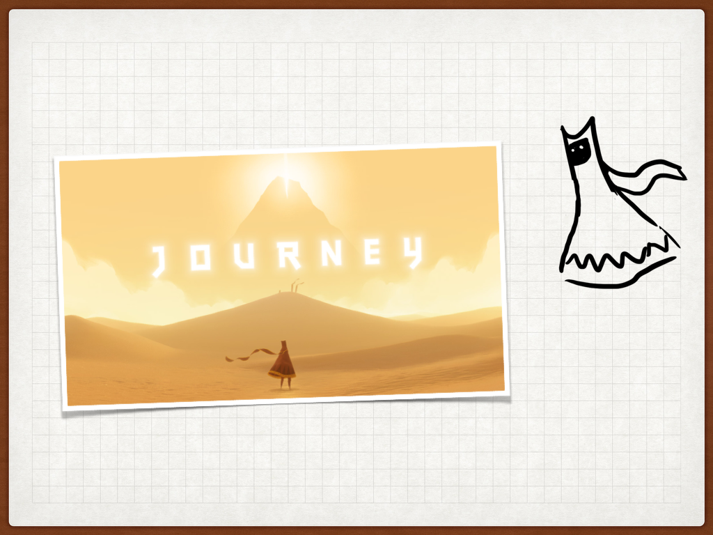
Journey is a game about the experience of a pilgrimage. Along the journey you may meet other travellers, if the system finds another player in the same area of the map, its up to you both whether you want to play the game together.
It’s an interesting exploration of how an experience can change when undertaken with a stranger. It lasts about 30-40 minutes and is exclusive to the PS3 and PS4.
Through out the game the main goal is often visible.
UX: Be clear on the main objective and make sure it can be achieved, from wherever the user is.
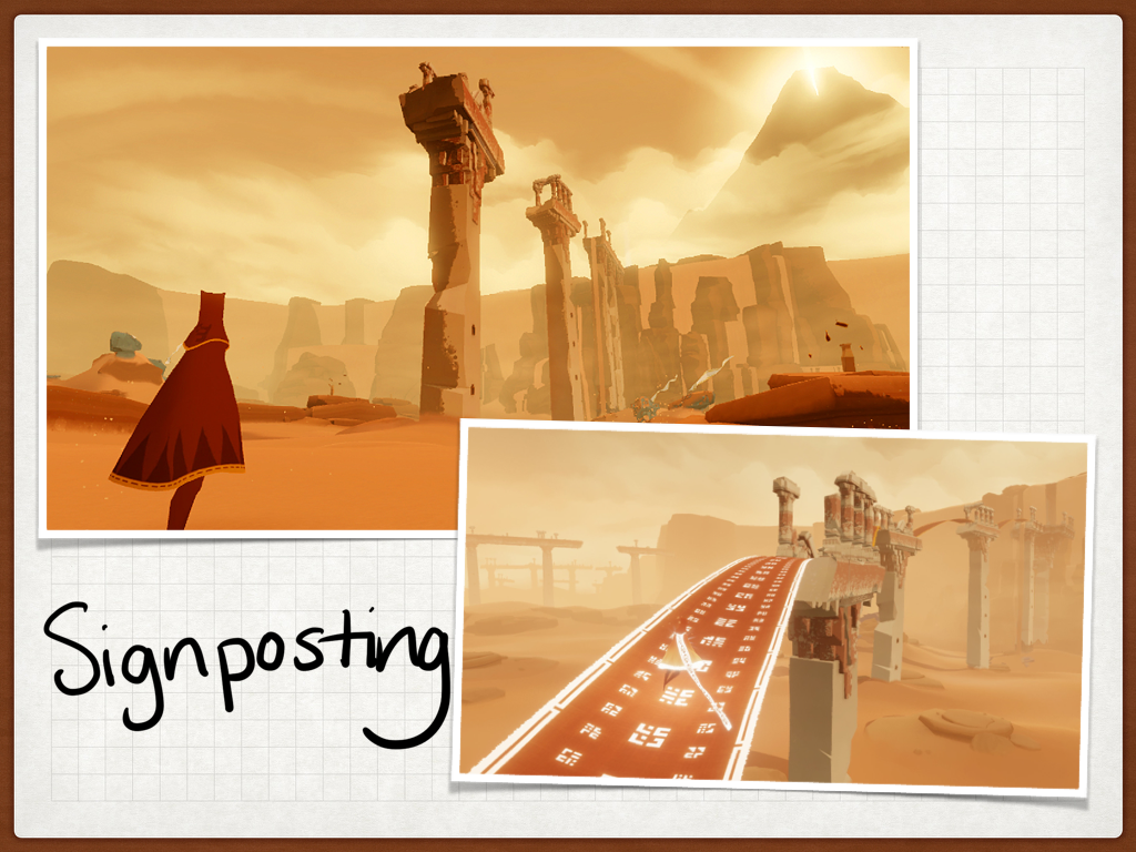
Movement and light are significant indicators in the game; this a common dynamic in games design. Immediate goals are often moving in the distance to guide the player. They light up on ‘contact’ to give the player feedback on their success.
UX: What feedback do we give our users? Does it delight?
If you are interested in signposting in games also look at Thatgamecompany’s earlier game Flower, which makes great use of in game signposting.
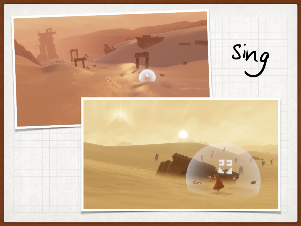
In Journey a lot of the complexity is removed, your actions are restricted to moving, jump/flying and chirp/singing. This simplicity serves two functions, it lowers the barrier to entry of the game, it also minimises the way players can ‘grief’ each other (a term form messing with someones game).
The chirp is responsive to the way you push the button. A short little quiet chirp for a tap and a louder bigger sound if you hold the button and then release – the animation is like you are breathing in to give a big yell. It serves a couple of functions in the game:
- This is the only way to communicate with another player.
- It makes finding each other easier/possible.
- It also allows you to ‘recharge’ your companion.
So it is most powerful when used with a companion player. It also taps into Universal Principles of polite language, which is the gap in conversation between when someone stops and the other person starts. By removing language from the communication these universal principles become how we communicate. They are fairly standard across cultures; the Danish have the longest gaps and the Japanese the shortest, but we are surprisingly consistent across cultures..
UX: How can people use/misuse your product? Can you simplify it?

Although you can play Journey alone, finding a companion is delightful. The large open spaces that the game is set in creates a sense of loneliness. It is also more powerful to travel together – it recharges the jump/fly when in close proximity and it keeps you warm – you protect each other.
Journey creates empathy, which is incredibly rare in a game, which is often a competitive space. It removes the things that differentiate us, such as language, gender or other identifiers. It only tells you who the other player(s) you met at the end, after the credits.
It creates an emotional experience; which is how we interpret the world. It brings emotion into a game. Journey also recognises that it is far easier to create empathy in a one to one experience. It is more powerful than one to many, even with if the one is a stranger.
As a game it is transparent about the experience of the player, there is also a scarf – that shows how much you can fly, i.e. how immediately powerful you are within the game space. The game rewards multiple play throughs and also indicates whether you are able to help your companion or can be helped. It established a leader/ follower dynamic, but it is still up the the players to choose if they undertake their role of not.
Fundamentally we like to help people – it makes us feel good about ourselves, and Journey taps into this.
UX: Can you reward your user for becoming an expert? Can you utilise that expertise to help improve the experience for a new user?

Flying is a powerful mechanic in the game, but limited, unless you stick together. If you work together well – this is the ultimate tool in the game – it makes you able to ‘beat’ the game. However it is hard to achieve and harder to maintain, so I couldn’t find a screenshot. This fan art however captures the delight and empowerment you can find with this experience.
Journey gives it’s players the opportunity to delight, even if you are being helped, you feel empowered, like the kid above; capable of new things you couldn’t do on your own.
UX: Can your users support each other? How do you recognise and support this behaviour?
Keep talking and Nobody Explodes, a game of bomb disposal.
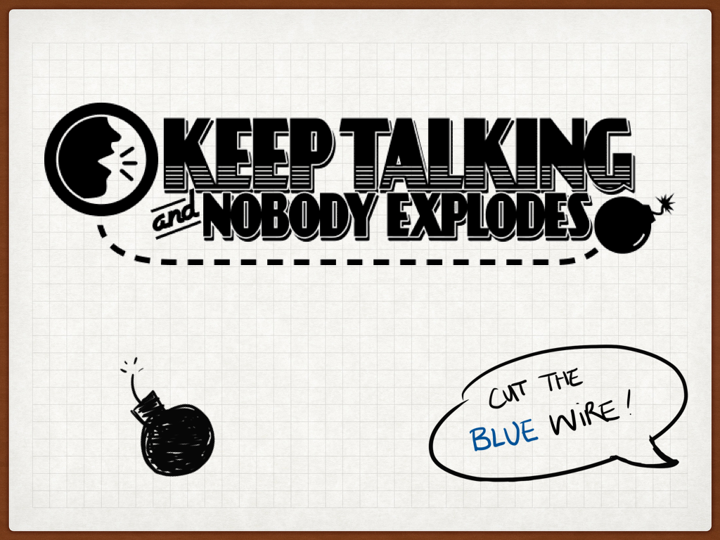
A co-operative game of bomb disposal, success depends on clear communication under pressure, with timely and accurate action.
One player defuses the bomb, everyone else supports them by reading the bomb manual.
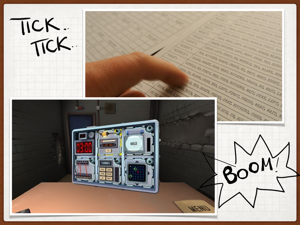
The game applies a ticking timer and the fear of failure to increases the pressure. Fear changes way you think, so you are depth first, rather than breadth first, ultimately triggering a fight, flight, freeze response.
It makes you a superhero! Unless you are an actual bomb disposal officer the chances are you’ve only experienced this in films or television. It achieves this superhero feeling by giving you back control, rather than removing the complexity. Creating a sense of control is fundamental to behavioural design.
UX: It’s not always about automating and simplifying, sometimes its about giving back the user control, or giving them the information to make good decisions.
The game slowly increases complexity, building on established skills.
UX: Help your users become experts.
If you like games about communication and multitasking also check out Spaceteam- a mobile game about shouting in space.
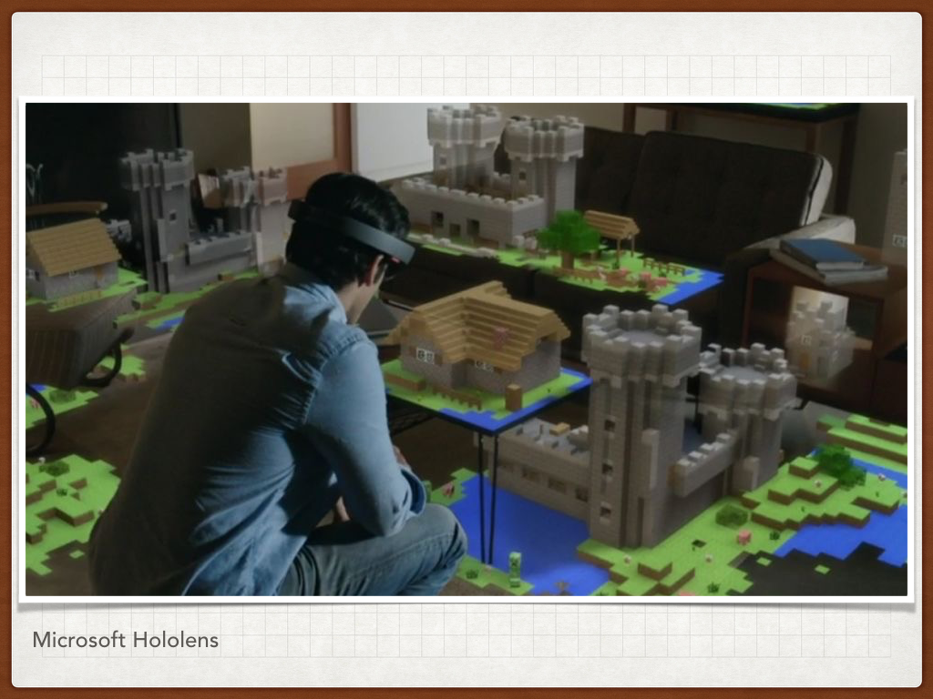
This game addresses the insular problem of the headset with Virtual Reality, where only one person can play, everyone else is an onlooker. By embracing this, it turns VRs weakness into a strength.
Divided by context, with different physical spaces and interaction types, but a singular objective. It can now needs at least 2 players and can accommodate many more.
UX: Context! Consider where you user is and how that affects how they’ll use your product. What are your constraints? How can they be a benefit?

This kid is an expert user – he is using the control pad while effectively blindfolded.
Games controllers have got increasingly complex and there is an assumed level of understanding, but give a games controller to someone who doesn’t play games and they will spend as much time starring at the controller as they will the screen.
UX: What barriers to entry have you created? What knowledge have you assumed?

Augmented reality vs. Virtual reality. With Augmented Reality you are not disconnected from your surroundings, and therefore are less vulnerable, but it is still a singular person experience, so there’s a disconnect.
Games are often still technology led, rather than people led.
UX can make games better
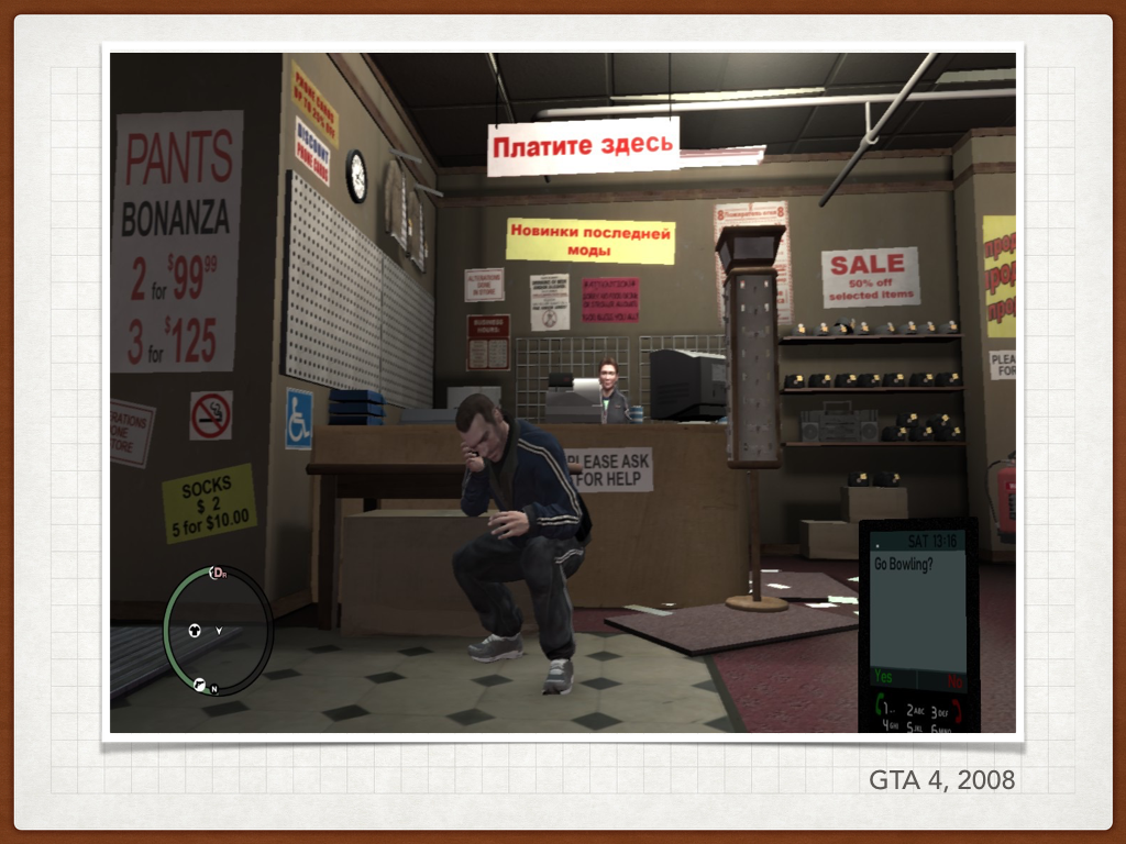
The phone in GTA 3 that gave you calls to action and new missions, but was completely unreadable if you weren’t on a HDTV.
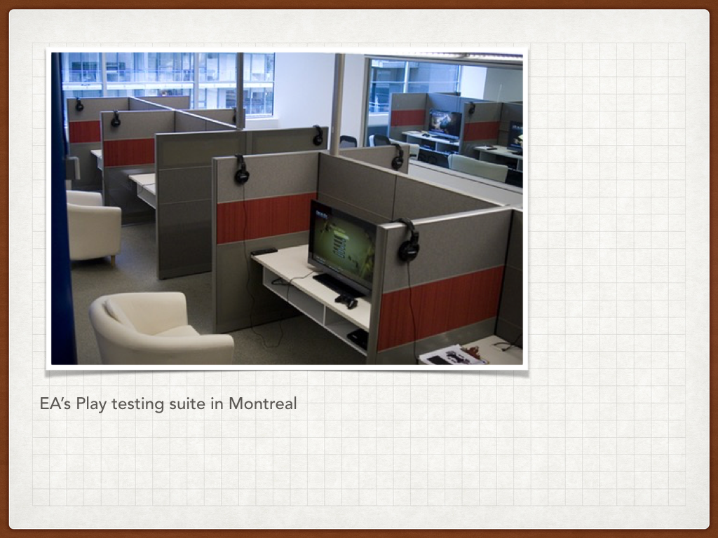
EA’s testing suit below, while not RockStar who make GTA, gives us some insight into the problem. All the set up is all identical, good equipment and this does not reflect the way many people play games.

Destiny.
It’s less about needing a UX designer, and more about how game design affects behaviour – not always for the best. There’s a lot of discussion about whether games are addictive, and we’re not going to solve that here, but from a UX perspective there’s something interesting to dissect.
Bungie arguably released half a game, probably to be able to afford to make the rest of the game. After disputes with key members of their staff – including their writer – the story was non-existent on launch, but cost of development was estimated to be about half a billion dollars!
Its a very good first-person-shooter experience. They get the basics right and they’ve worked to try and reduce the toxic environment often found in online FPS (first person shooter) games. But the game itself is designed to keep you hooked/playing:
- It’s full of grinding – doing the same task over and over, in order to level up or hope of getting a loot drop
- Lots of small dopamine hits – to keep you doing just one more mission. (pretty common in many games)
- Getting the basics right – shooting, running etc. means the game gets out of the way of the player
- There’s a constant sense of progress, moving goal posts – new levels, new weapons etc.
- Game content (especially at higher levels) are number dependant – so there is social pressure to keep playing
In the last few years its the biggest game which was equally loved and loathed by the players. It’s beautiful, but it is worth questioning the mechanics it employs.
UX: There’s an opportunity for abusive design.
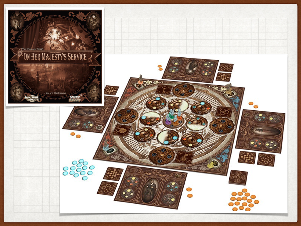
On Her Majesty’s Service, is a really beautiful steampunk game. But it is also a game where your move changes the board layout. You can’t plan your go as the board layout constantly moves. This happens in chess, but there is only one other player, so both amount of time and change are limited. Because you can’t plan, the downtime between your goes is then just waiting time.
In addition key information is obscured by glass beads, making it harder to make critical decisions quickly, resulting in longer wait times. If you can’t do something between your turns it becomes boring.
UX: Design for between the experiences. Don’t hide critical information.
Can games make us better designers?
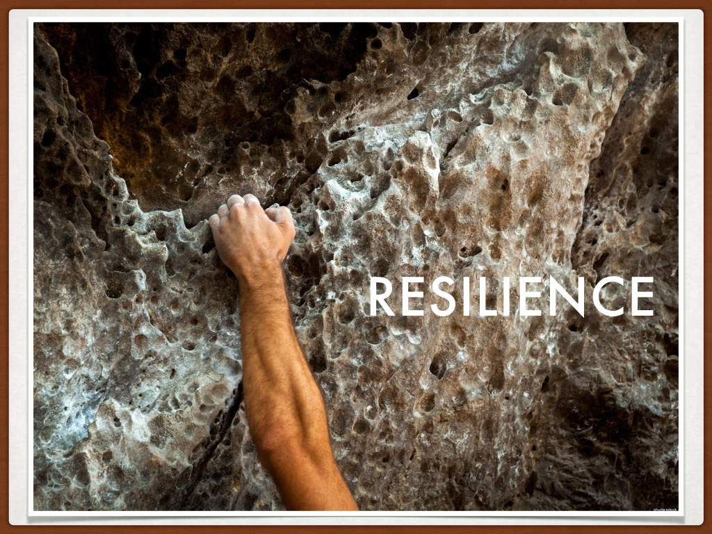
Resilience to keep trying new things
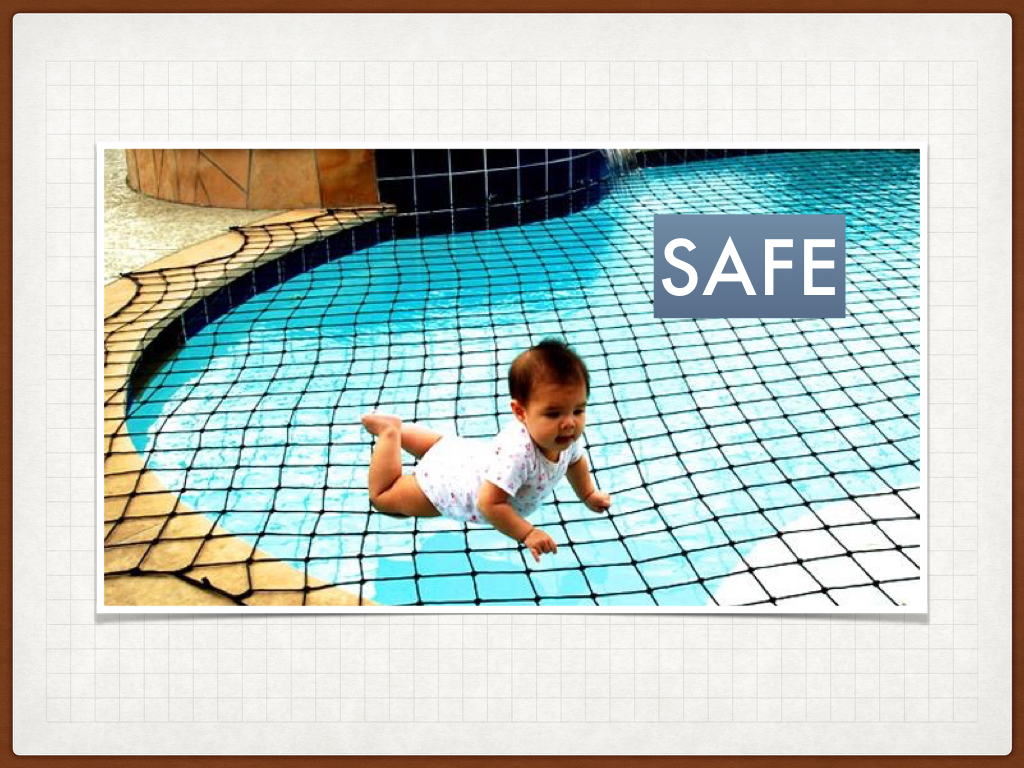
Safety – removes the fear of failure

Play is fundamental to learning (in a social group) – it’s the start of culture

Not always about removing the challenge, but giving back control
Further reading:
- http://www.interactivearchitecture.org/artificial-intelligence-in-the-architecture-of-games.html
- https://www.ted.com/talks/margaret_gould_stewart_how_giant_websites_design_for_you_and_a_billion_others_too
- Design with Intent – O’Reiley – Dan Lockton
- http://gdcvault.com/play/1017940/The-Science-Behind-Shaping-Player