
Games UI Series
For some time I have written about both my professional and social interests on this blog; covering user experience and gaming, but I want to combine them and look at user interface design in games. I think this is an oft-neglected part of games, especially with the usual budget and time constraints, however as with any software design the usability of the user interface can have a profound effect on the user’s experience.
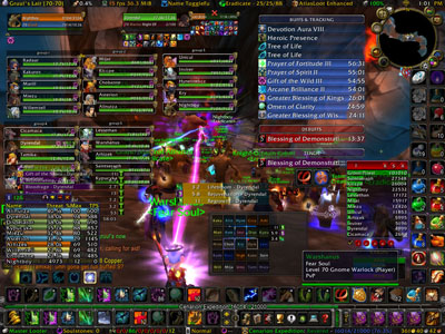
An advanced user experience on World of Warcraft
Usability in games is not restricted to on screen interactions, there is a such diversity of ways to interact with your gaming platform of choice; be it joypad, keyboard, touch screen, or no controller at all. This makes the platform and method of interaction a key part of the user experience in games, as such I will explore the strengths and weaknesses of these human-computer interfaces.
Some games designers and developers think that creating games is completely different to creating other software, because they are creating entertainment rather than tools. However recently as we have seen an increasing overlap between games and applications e.g. Epic Win we can see that these lines are far more blurred than previously considered. Software development has only recently realised the commercial value of user experience, but games developers often consider themselves the audience as well as the creators, failing to realise that their familiarity with their game hampers their ability to see their product impartially; perhaps more frustrated by the focus groups that require them to “dumb down” games than they are in the issues that may cause that confusion in the first place. While games do need to offer challenges in order to evoke a sense of achievement, these challenges should be designed and deliberate and not a hurdle of a poorly designed interface.
I was delighted to see that Edge has added to its staff Graham McAllister; the CEO of Vertical Slice, the UK’s first usability testing company to focus solely on games. This recognition of the need for usability in an industry leading publication can only help raise the profile of the value of understanding your users.
I’m hoping to write a series of game reviews, which look specifically at the UI and give a heuristic review on their strengths and weaknesses as well as offering possible alternative solutions where appropriate.
RockStar’s Red Dead Redemption and LA Noire
I wanted to look at how RockStar have evolved their user interface from Read Dead Redemption to their latest game, LA Noire. Their games all have consistent game mechanisms, so it is possible to chart the evolution of their interfaces, even from GTA to their latest offering.
[more]
I should state that I played Red Dead Redemption on the XBox 360 and LA Noire on the PS3, however the hardware has minimal impact in this review.
The repetition of game mechanics means there is a lot that is familiar to anyone with experience of RockStar’s earlier games. This is great for usability as you can transfer learning from one game to the next.
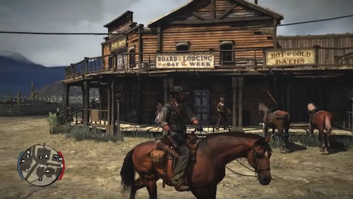
Radar in Red Dead Redemption
In both RDR and LA Noire we have the familiar radar interface with indicators as to where the next story activity is. Which makes it clear how to progress through the game, something that is essential when you are playing a relatively linear game in an open world environment.
Although LA Noire makes a concerted effort to offer a more film like experience and supports this by removing the HUD whenever possible, preferring instead to offer feedback within the game.
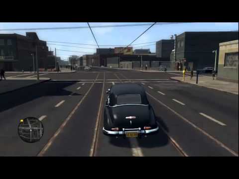
Radar in LA Noire
The weapons system is also simplified in LA Noire, you just have a default weapon, you can pick up more powerful weapons that enemies drop in combat, but these are not retained. Thereby removing the need for an inventory and simplifying the menu system considerably. With no inventory the game now offers quick access to the map.
In RDR the map is put at the top of a rather long menu as the default choice, but in both cases viewing the map offers limited information, it gives you some context of your location in the world, but many places on the map aren’t marked until you discover them. This is a game mechanic, not a usability issue, used to encourage the player to explore the land, there is no critical gameplay missed if you don’t discover all of the map, but doing so offers rewards. A similar mechanic is employed in LA Noire, but less successfully, perhaps the very linear nature of the game removes the desire to explore in the same way or the reward offers less incentive.
In Red Dead Redemption there is a lot going on and as a result the menu system is complicated and not always clear. Your inventory is on the back button, with several different pages to tab through, while the start button brings up a hefty menu that includes both game options and game play aspects. This part of the game I find unintuitive, often accessing the wrong menu accidentally. There is a great deal of information in the menus as well, with everything except ‘Map’ having a second tier of menus, and I hope you have HD or you’ll struggle to read a lot of the text based information.
In contrast I love the very stylized main menu for LA Noire, it really sets the tone for game, but is kept simple and clear.

A menu screen in Red Dead Redemption
In LA Noire you can dig into the game stats in the same way as earlier RockStar offerings, which is a good offering for a specific type of gamer. They are not core to the game play, but you can go see how much more of the game there is to get involved with as well as examining your own playing style. It doesn’t do much for me, but I can see that a cricket fan might well enjoy it.
LA Noire lacks multiplayer and has a significant shift in game play driven by the use of new technology to capture facial expressions, this does create new opportunities for usability and game play interaction. The core mechanic in LA Noire, when not pointlessly driving around between crime scenes is the “Lie, Doubt, Truth” mechanic which asks the player to make a judgement call based on evidence collected and more significantly by reading the facial expressions of the actors involved. The limited options to handle a complex task are key in being able to drive the story and gameplay forward. Keeping the options simple allows you to concentrate on the complexity of juggling evidence and lines of questioning along with reading facial expressions and while I like the simplicity of the solution I found that the results were sometimes mixed.
Also there were significant issues with introducing the gameplay as important information explaining this new method of gameplay would appear during the interview, at the time when the player’s cognitive load is focused on the interviewee. It was such a distraction I had to play the first level through again and after discussing this with friends I found I wasn’t alone. This set a really bad precedent because it immediately knocks the player out of the linear timeline and you loose a direct sense of connection with the lead character in LA Noire. Not to mention I played the whole game without realising that if you accused someone of lying and then decided you didn’t have any evidence to support it, you could back out of the decision, presumably I missed that instruction.
The whole game is geared towards progressing regardless of if you get the ‘right’ answers, but this dynamic is broken at the first hurdle by the distracting instructions and the deliberate decision to not pause the gameplay to deliver them, so as to stay in the story. It would however have been better to offer the instructions before the interview, during the free roaming, where there are no time constraints, a possible suggestion is in the form of obvious ‘clues’ which the player can choose to engage with to get more information.
One thing both games do very well is the use of audio clues. LA Noire has audio triggers for clues and successful or unsuccessful questioning. They are significant to the gameplay, but also go a long way to creating the atmosphere of the game. In RDR there are audio cues to let you know what wild animals are about, you will almost certainly hear a mountain lion, before you see it and doing so could save you from a grizzly mauling.
Both games are different, so this exercise isn’t to say which one is better that the other, but to look at how Rock Star are evolving the game interface and where there is room for improvement. The menu system in RDR is greatly improved for LA Noire, so hopefully they will keep improving and simplifying it for any new games they develop. There has been some coverage about the conditions in which LA Noire was developed and RockStar’s relationship with Team Bondi, so I hope they don’t throw the baby out with the bathwater.
I hope they reconsider how they deliver game instructions too, although gamers will now have a better understanding of how to approach this kind of game going forward and new precedent for in game interviews based on facial expression rather than dialog options has been set.